The Article
MELLOW YELLOW OR RED RED WINE?
21st August 2026

Island Records and EMI – yes, both still exist on Planet Imprint – have recently unveiled the new redesign of their headquarters in London. Island bathe in yellow. EMI dwell in red
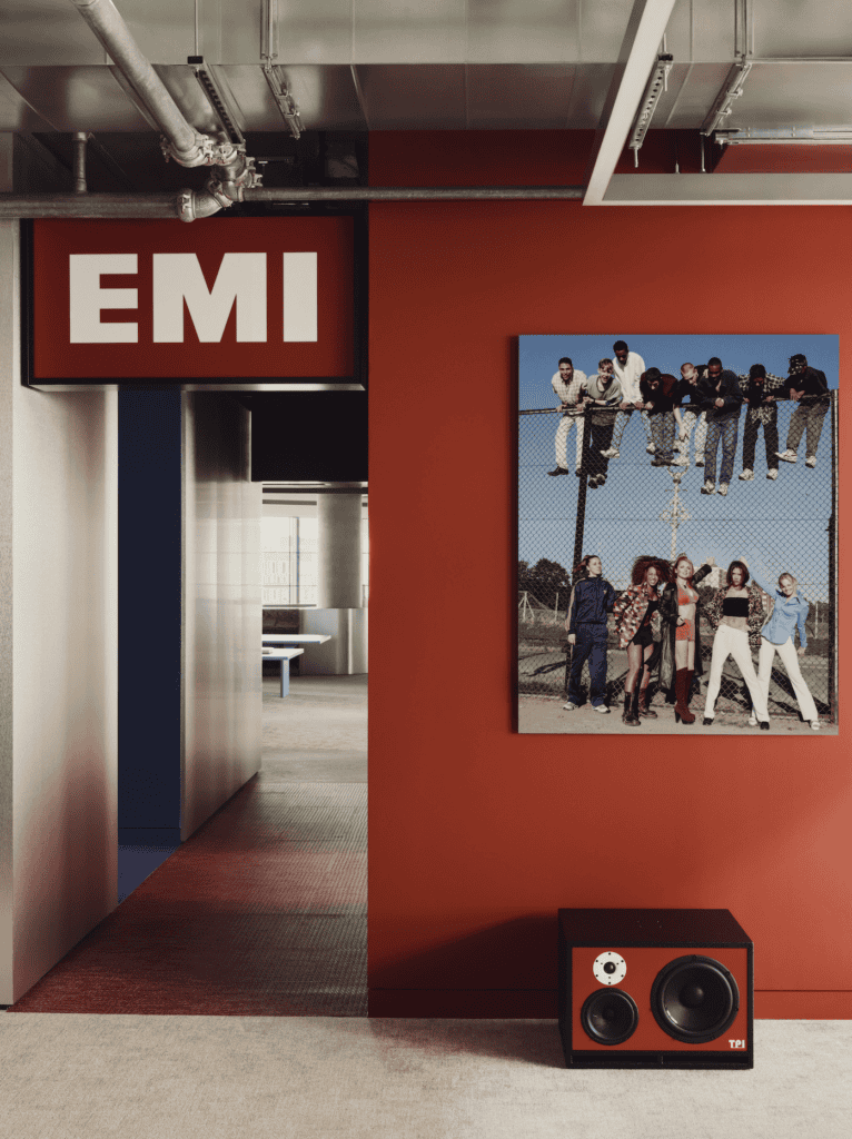
Both are kitted out with bespoke RN1 and M210 studio monitors by British hi-fi manufacturer TPI Aerospace. A company whose existence I am at once unfamiliar.
But maybe that’s because I’m skint and off the peg.
Within the EMI and Island void, you’ll find works by Turner Prize-winning artist Jeremy Deller. My ‘space’ is adorned by a those avant assemblages: the shopping list, an art installation named ‘Windolene’ and an unused roll of bin bags.
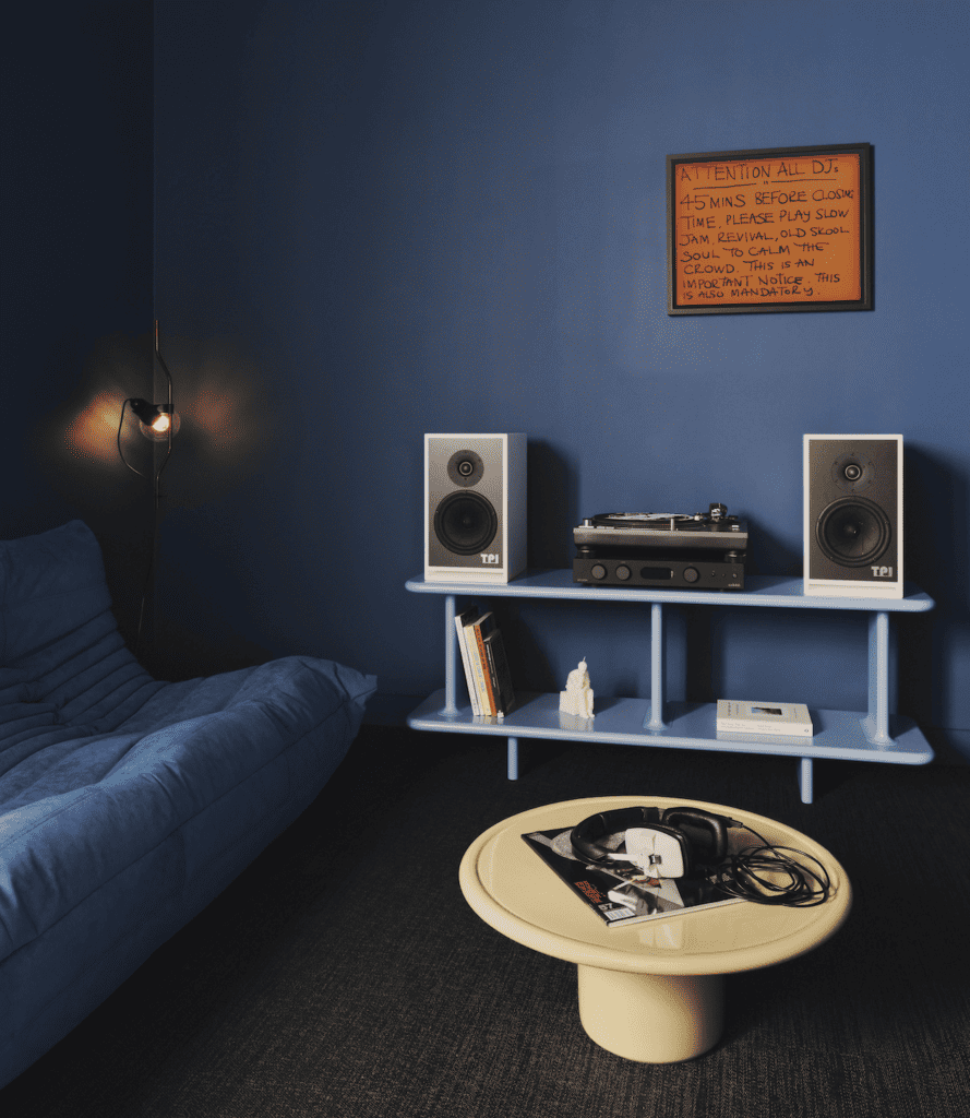
“In the new office redesign, sound becomes an architectural centrepiece and the bespoke soundsystem commissioned in collaboration with TPI marries the elements of sound, art and design.”
I married a little women standing 5’ 2”.

This “spatial mixtape” <sigh> took 18 months. There even had to be a “collaboration” with Interesting Projects and Studio Eye, the labels’ in-house creative studio.
I use Bob the decorator down the road. Our collaboration extends to the agreed use or non-use of Deluxe Marigold.

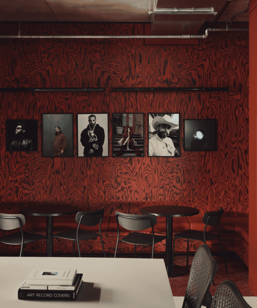
The project apparently brings together more than 70 historic and newly commissioned artworks, photography and ephemera spanning the cultural histories of both labels. Works by Annie Leibovitz, Thierry Noir, Jeremy Deller, Corbin Shaw, and Anton Corbijn are integrated throughout the space.
I have that faded picture of five dogs playing poker.
Island’s signature yellow Pantone 109C is paired with vivid pink Pantone 671C referencing its progressive and folk era between 1967 and 1970.

Is that folk? Or fancy?
EMI’s British roots are expressed through a “…subtly deconstructed Union Jack palette of red, white and Yves Klein blue.”
Which, of course, is what I always think about whenever I see the Union Jack.
No budget was discussed.
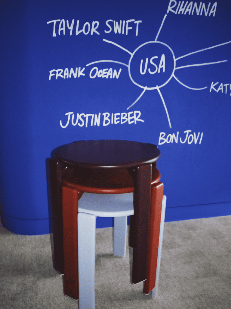
Music? What music? Sure, there’s the the posters that all look like they’ve been bought from Athena. So. That’s all right then.
Even so, no ‘Tennis Girl’, Lord of the Rings or that black and white poster of a muscle-bound man holding a baby. They missed a trick there.
Music to me is art. I do recognise that music has always been a product. Trouble is, it is no longer even that; it is increasingly manufactured as disposable content for the attention economy. A bit like attention colours of bright yellow and red. Sorry Pantones 109C & 671C.

So I demand another poster. Amongst your Elton John’s and your Beatles.
A close up of a wall socket. To represent the disconnect.
(All images c/o Kensington Leverne)