The Article
MUSICA ALL-IN-ONE FROM COMO
24th May 2022
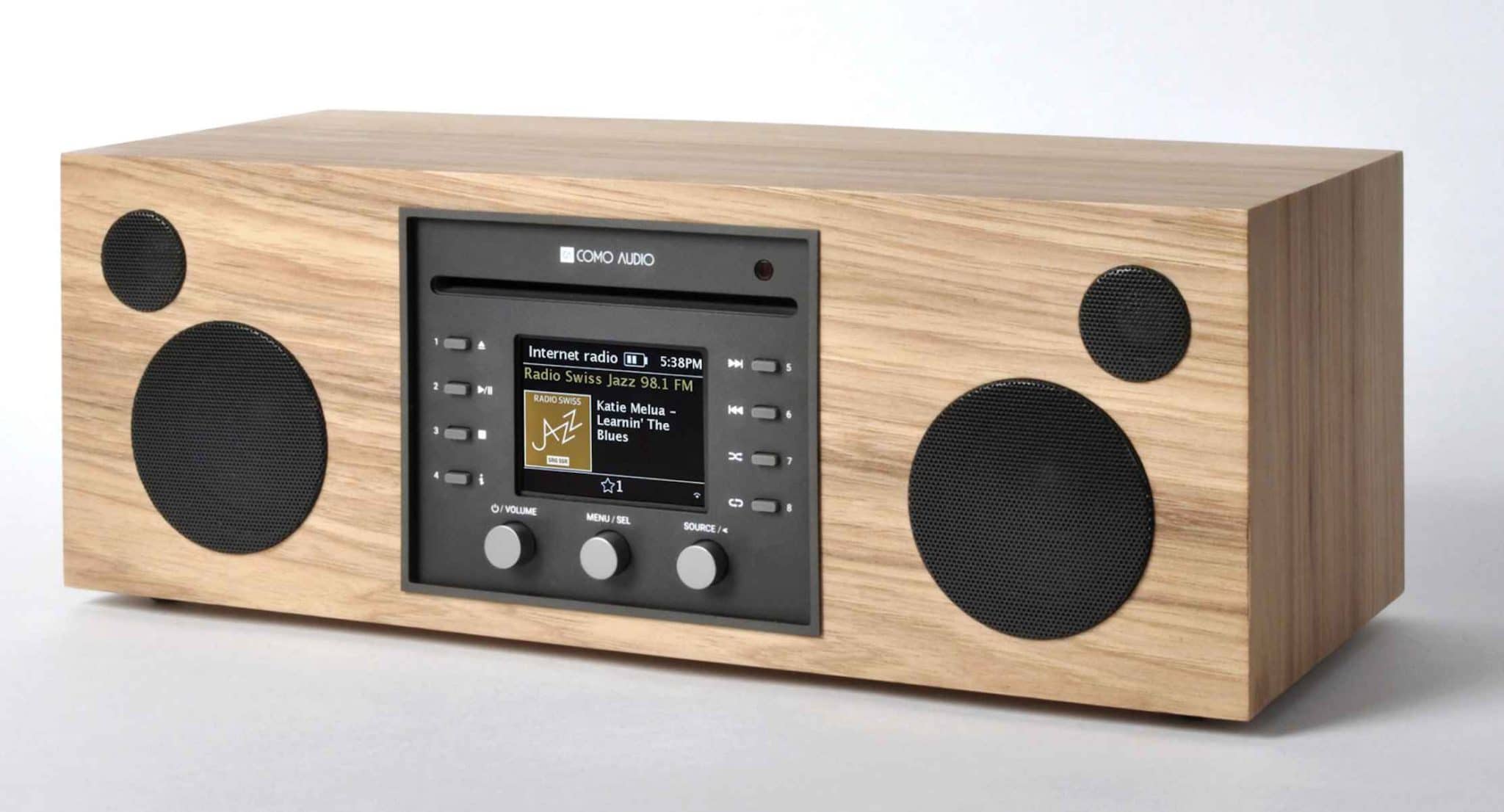
Is the feature-packed Como all-in-one unit a viable alternative to the larger units currently on sale? Paul Rigby doesn’t know if he’s Como or going
Since I reviewed both the Ruark R5 (£1,099) and Technics Ottava F (£799) all-in-one units, I have been using them occasionally to listen to music away from my central listening room. In my office mostly, where my desktop computer resides and where I do most of my written work, video editing and the like.
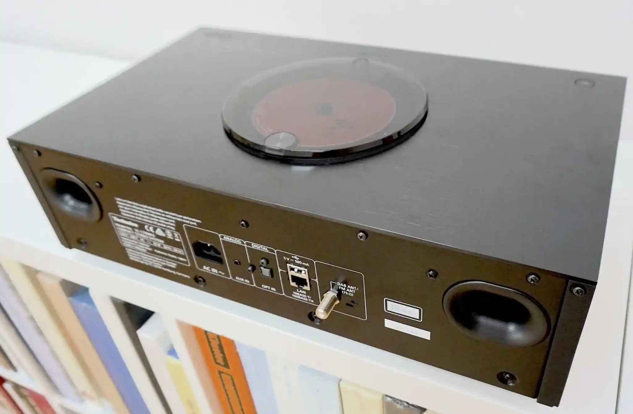
Despite the fact that they are brimming with features and even though both sound very nice indeed, there is an issue with both units.
They still demand a relatively high amount of real estate. At 142 x 520 x 300mm, the R5 gives you a very long chassis while, at 450 x 143 x 280mm, the Ottava might be a touch neater in length but it does push itself out in depth terms.
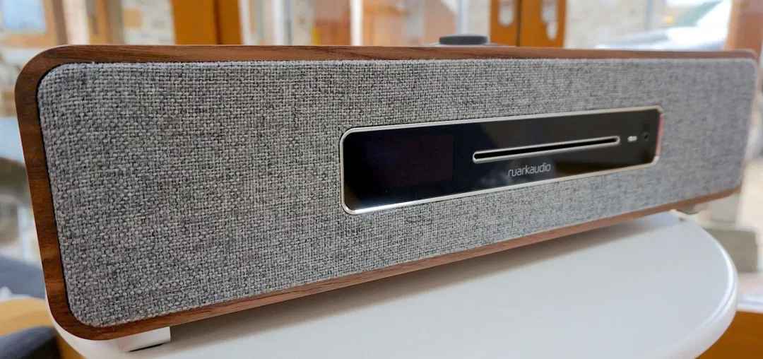
The question is this, therefore. Do you also need to commit to such a relatively large footprint? Both of these products, I have to say, can be physically imposing.
So can you reduce the size but retain quality in terms of build, aesthetics and, most importantly, sound quality?
Well, Como Audio’s Musica is one such alternative for those looking to pump out music in their office, bedroom, hobby room, garage or kitchen.
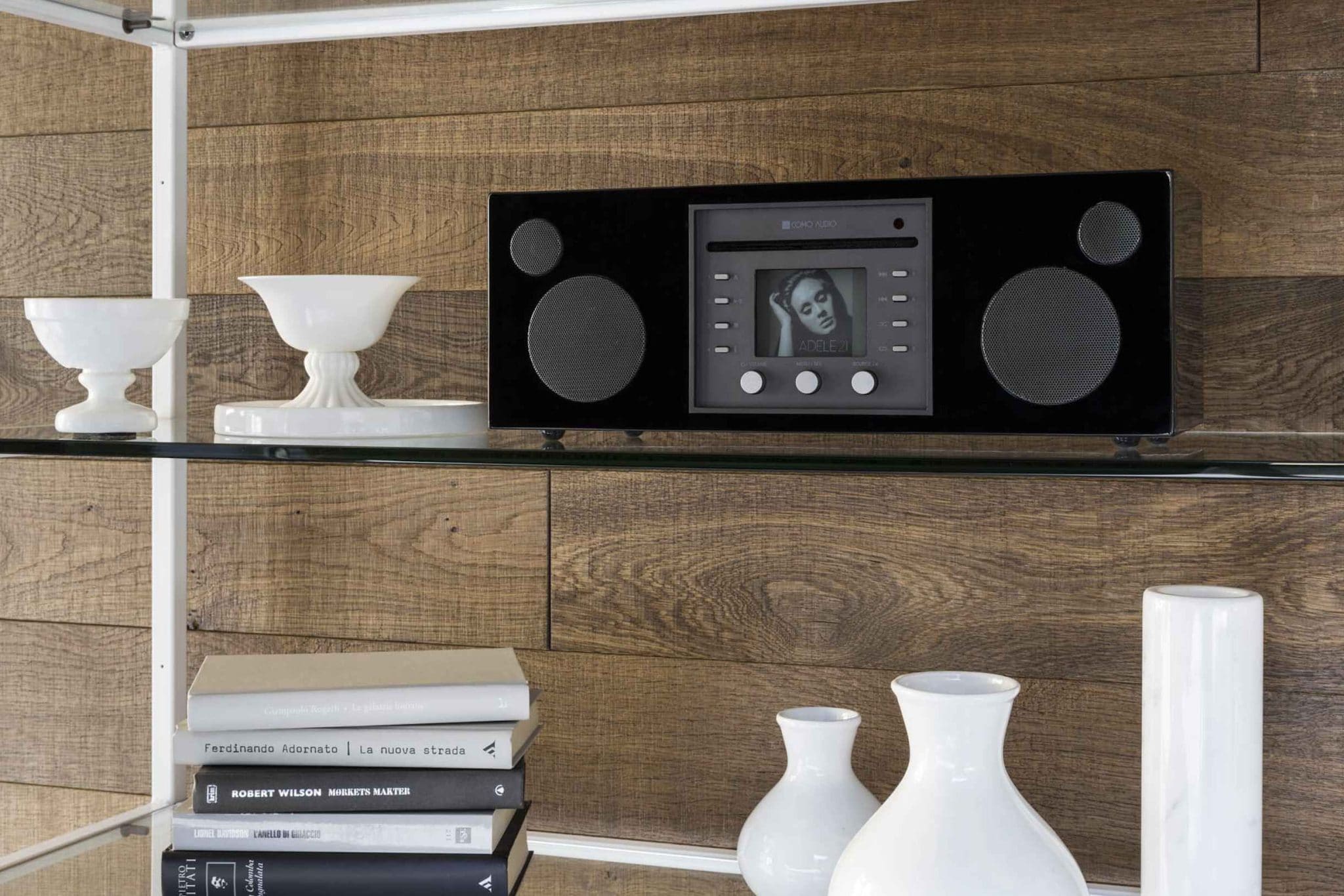
It is an all-in-one with plenty of features (which we’ll get to in a moment) but at 405 x 149 x 166mm, it’s much narrower than the R5 and no where near as deep as the Ottava. In short, the Musica will be easier to slot into a relatively restricted space while its weight, half that of the Ottava and even less than the 9.5kg of the R5, at 4.2kg means that it can be easily repositioned, if required.
FINISH
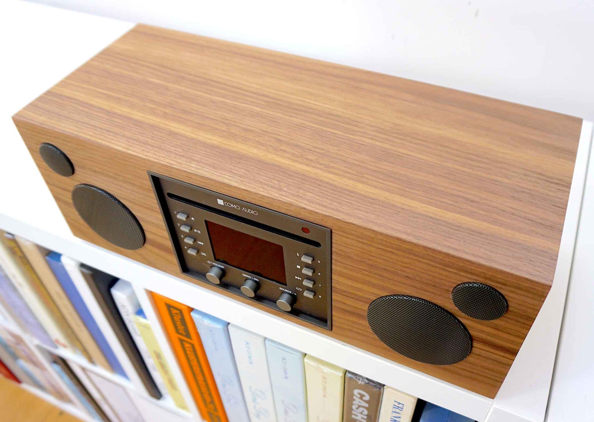
The Musica is rather prosaic its designing finish. The Technica Ottova has a metallic, nicely sculptured chassis with moulded slats on the front while the Ruark uses real wood veneers and fabrics that offer a feast of quality to the eye.
The Musica uses MDF with a basic veneer, sharp edges and a rather stark appearance.
The Musica’s finish is tidy, clean and neat and there’s absolutely nothing wrong with it but it doesn’t impress in the same way as the Technics or Ruark.
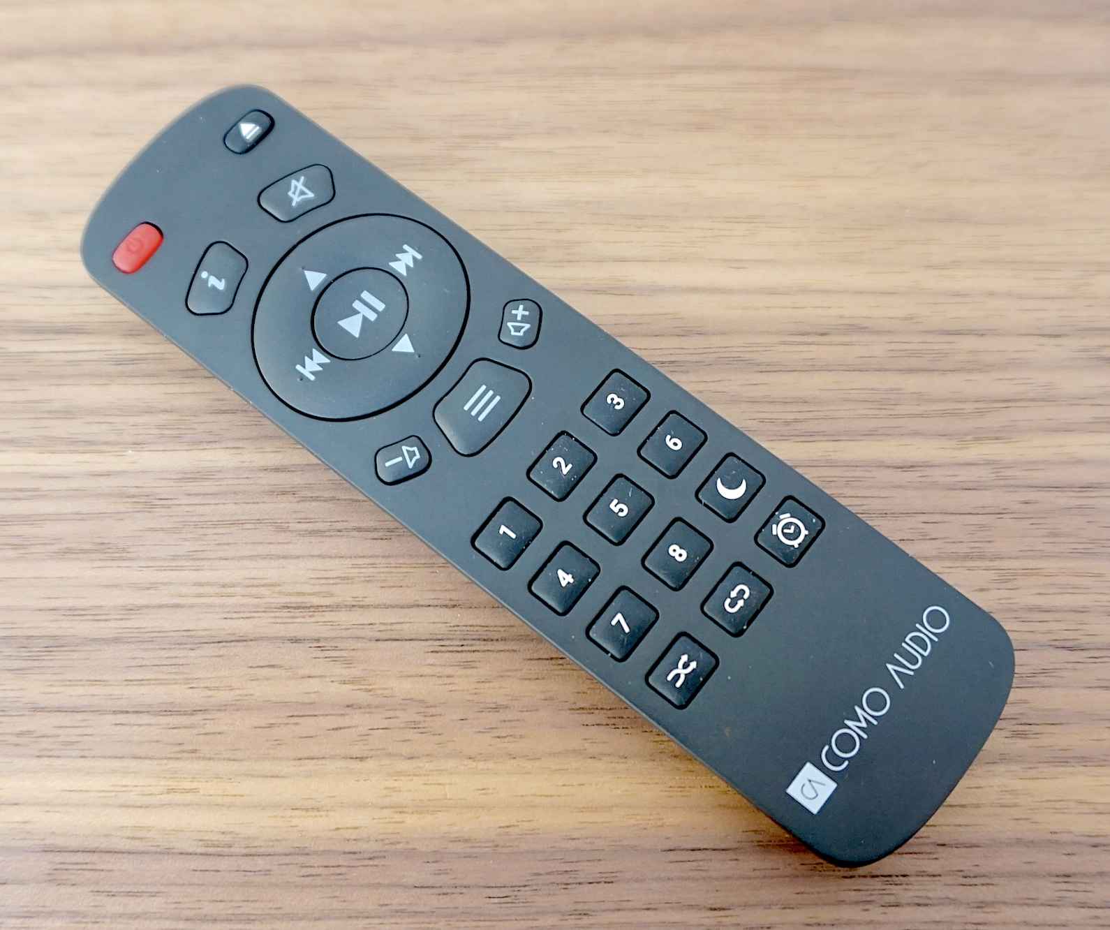
The Musica arrives with a remote control, as do the other units. The Technics offers a full-size, TV-like/AV-esque remote, the R5 provides a fun, unique flying saucer-shaped remote that adds to the entire design ethos and matches the built in interface on the R5’s chassis.
The Musica gives you a small, plastic, rather flimsy remote. Again, there’s nothing wrong with this remote in and of itself. It offers the functions you need and does the job.
Even so, if aesthetics are critical to you and you need the looks as well as the sounds then consider the Musica carefully and ask yourself if the Musica’s rather conservative, simplified presentation is for you.
FEATURE COUNT
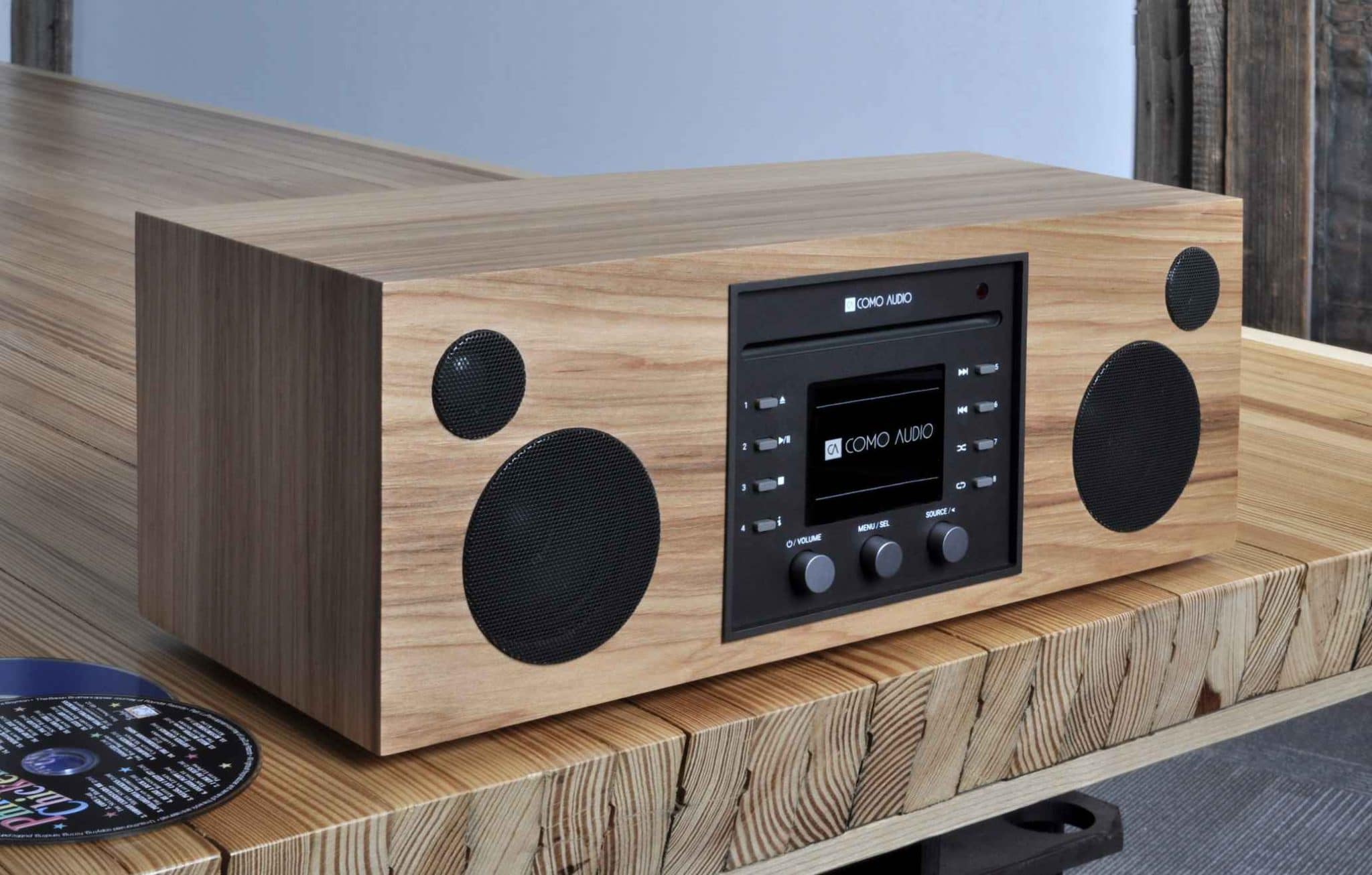
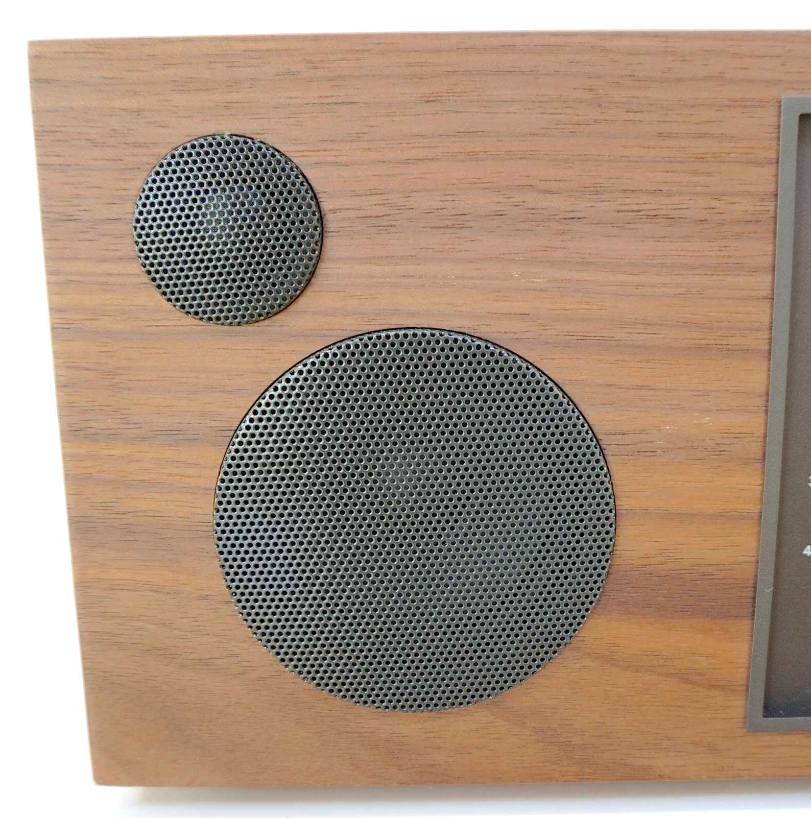
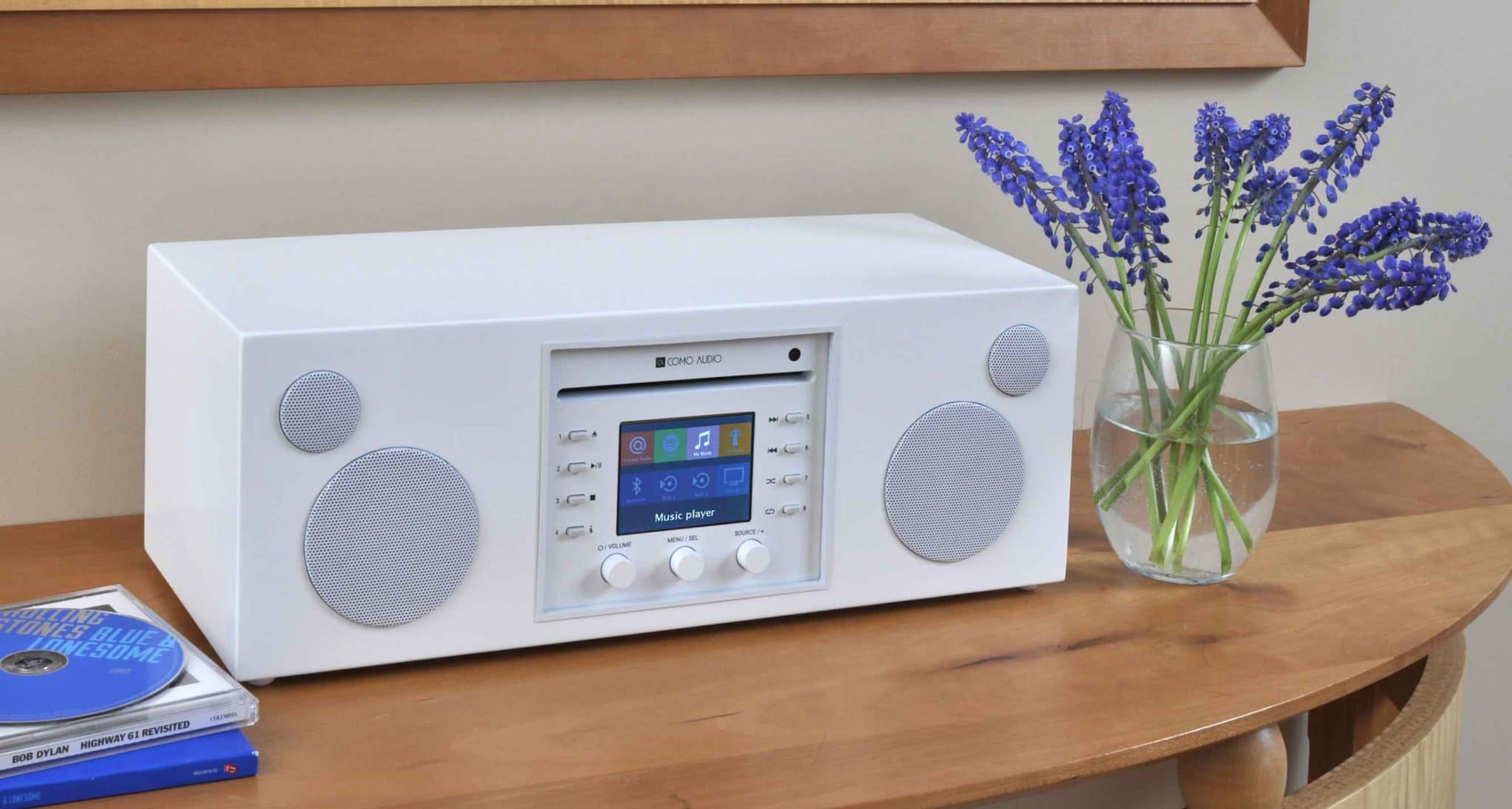
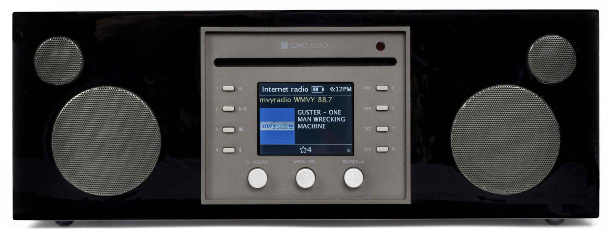
So what’s are the Musica’s capabilities? What features does it offer? This is a 30W unit powered, not surprisingly, by a Class D amplifier. To the left and right are speakers consisting of a 19mm (0.75in) soft-dome tweeter and a 76mm (3in) paper-coned mid-bass unit. I was happy to hear this. I have heard cheap and nasty portable units with metal-based speaker units which tend to sound bright and edgy. More so because of the portable configuration. The more forgiving materials used here promised a better sonic output.
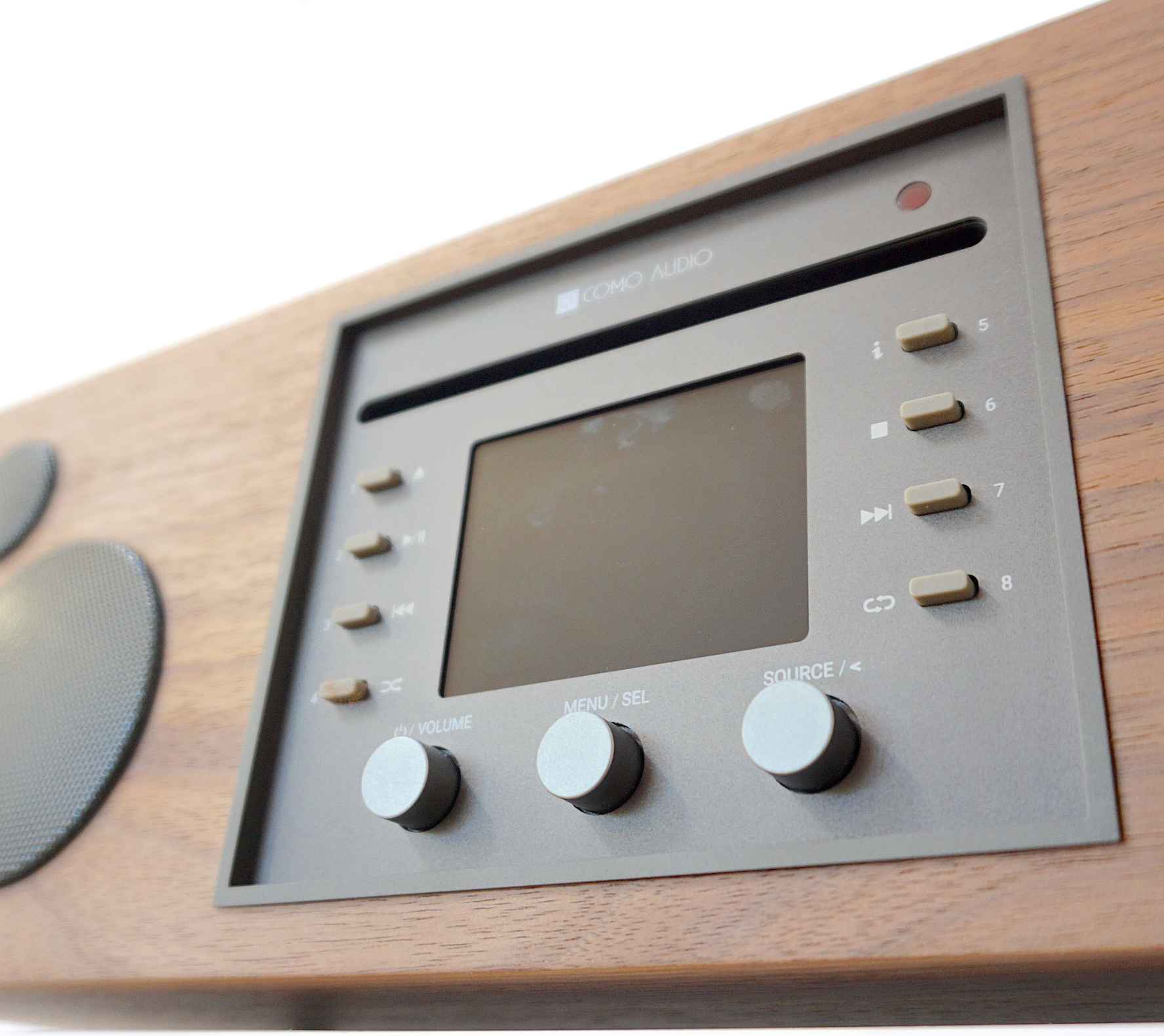
If we’re looking at the front of the chassis, the centre is where the action is and that is dominated by the full-colour, centre output screen. At the bottom of that, on the left, is a power/volume knob, a menu/select knob is to it’s right. Further along is a source/back knob.
Each side of the screen are two rows of buttons that offer twin functions. Top left is an eject button for the slot-mounted CD player, moving down you’ll find a play/pause for the same, track back and shuffle buttons. The four buttons on the right side consist of info (for CDs that offer that information), stop, next track and repeat.
These same eight buttons can also be used to save favourite radio stations.
As you can see, the front fascia is busy but the button/knob arrangement is organised and easy to navigate.
The issue I had with these buttons was that the Presets could not be labelled so memory’s your only recourse here if you want to remember just what radio station goes where…or a Post It note attached the chassis.
When you first switch on, you’re invited to run through a Setup Wizard which will connect you to your local network, look out for software upgrades and set the date/time.
The worst part was the long-winded password input for the Internet connection from the usual, non-keyboard, scroll along a grid of letters and click on your selection-type approach. This is a one-shot selection so it wasn’t a major issue.
MENU INTERFACE
The one real irritation was the picture menu interface itself which was full of feature icons. In ‘manual’ mode, utilising the controlling rotating knob fixed onto the radio, selecting the option of choice demanded running the highlight cursor right and left only. Move the cursor to the far right of line one, for example, and it then pops down to the far left of line two and so on. Problem is, you cannot move directly to your source icon choice. You cannot take a short-cut and move vertically up and down lines and then across to speed up your feature selection. If you want to move from the top left option on the first line to the middle selection on the second line, you will need to patiently scroll horizontally, line by line, until you eventually arrive at your icon of choice. Teeth-grating. More so, if you’re in a hurry, then you risk over-running because the source knob/software combination is not firmly locked together, so then you have to scroll back again.
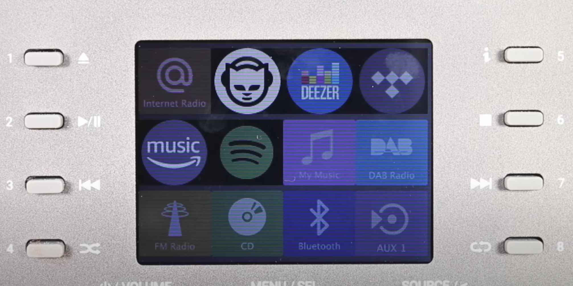
This clunky interface operation was present on Como products over five years ago and it was clunky even then. Nothing has changed, it appears. There’s a solution, though, the included app.
Here, sources including Internet Services can be accessed directly, quickly and efficiently. (Oddly enough, you can also control the Ruark R5 with it too!)
The Musica also features a couple of alarms and a sleep timer function.
Streaming is possible via Bluetooth while the built-in CD player can handle burned discs as well as the usual pressed, silver commercial offerings.
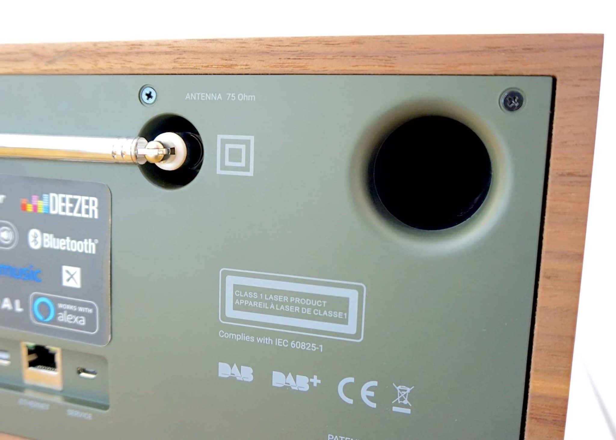
On the rear is a power socket and port for a separate radio aerial plus a bass port.
Below-centre is a range of connectivity ports. From the left to the right of this strip, you’ll see a DC connector for an external power supply, 3.5mm headphones port, line out, two auxiliary ports, optical, USB for a thumb drive of music files, Ethernet and a Service port.
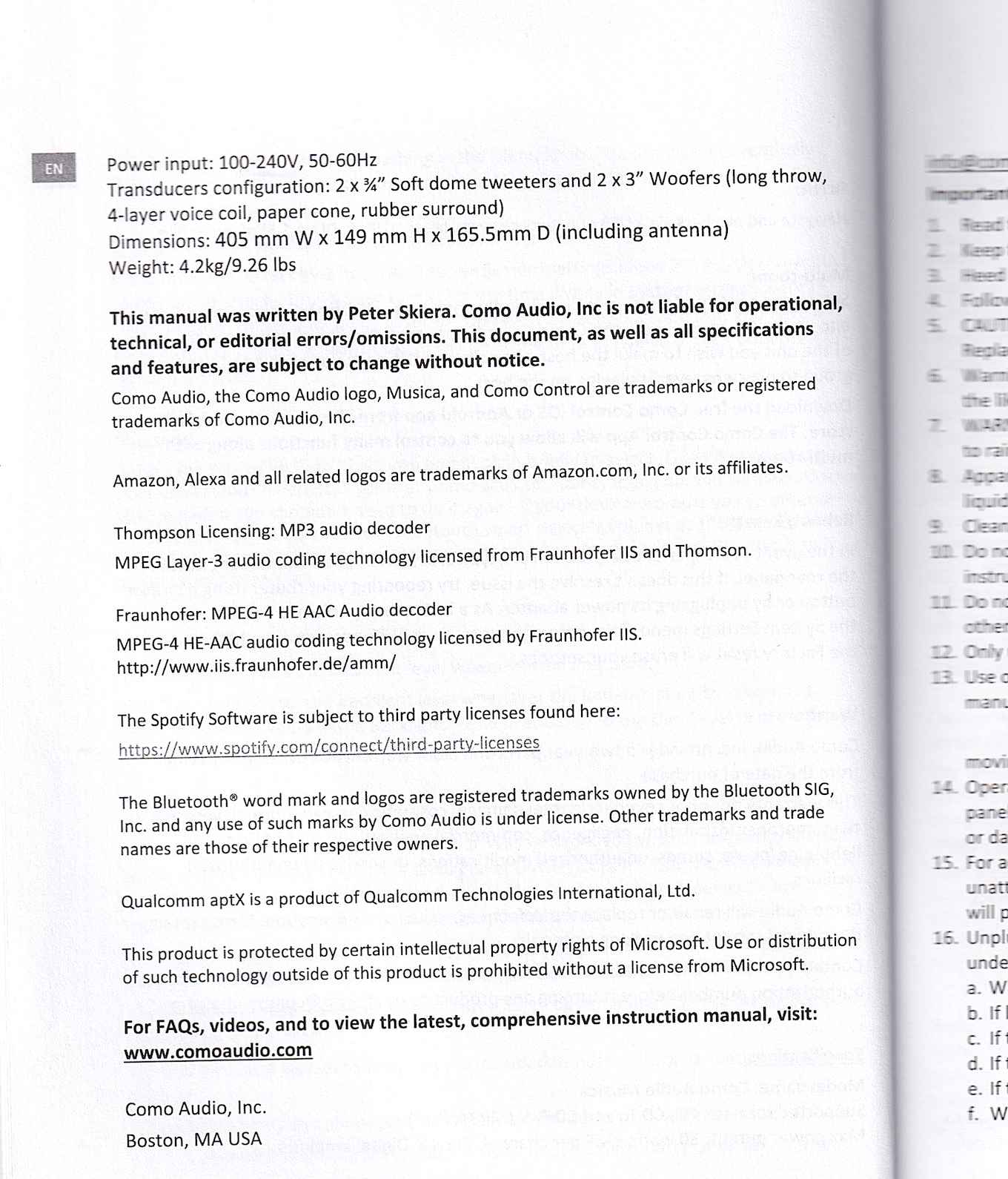
Finally, I thought it amusing that Como refused to accept any responsibility for any possible errors or omissions in the manual and instead, and unusually, name poor old Peter Skiera as the poor sap who wrote the manual (i.e. it gives me the impression that Como is declaring, “It wasn’t us! We didn’t say that! It was Peter! Blame Peter!”). According to Como, any pitchforks and flaming torches should be directed at him, instead.
So let us leave Mr Skiera, on the run and fearing ‘manual’ retribution from the shadows of every dark alley and through the hollow eyes of every passing stranger and consider just how this box sounds shall we?
SOUND QUALITY
I grabbed a copy of Design’s reissued, anniversary self-titled 1971 album (Vacancy) and had a listen. This CD presents sunshine pop cloaked in complex vocal harmonies so provides a sonic challenge.
CD & EQs
To begin, I wanted to find the right sound configuration for the Musica because, like many luggable all-in-ones, this design features a suite of EQ options. Now, normally I would reject any EQ section and would head straight for the ‘flat’ or unaltered sonic delivery. For this type or product, with everything packed into a single chassis and electronic noise swimming all over the place, EQ tweaking can be a good idea.
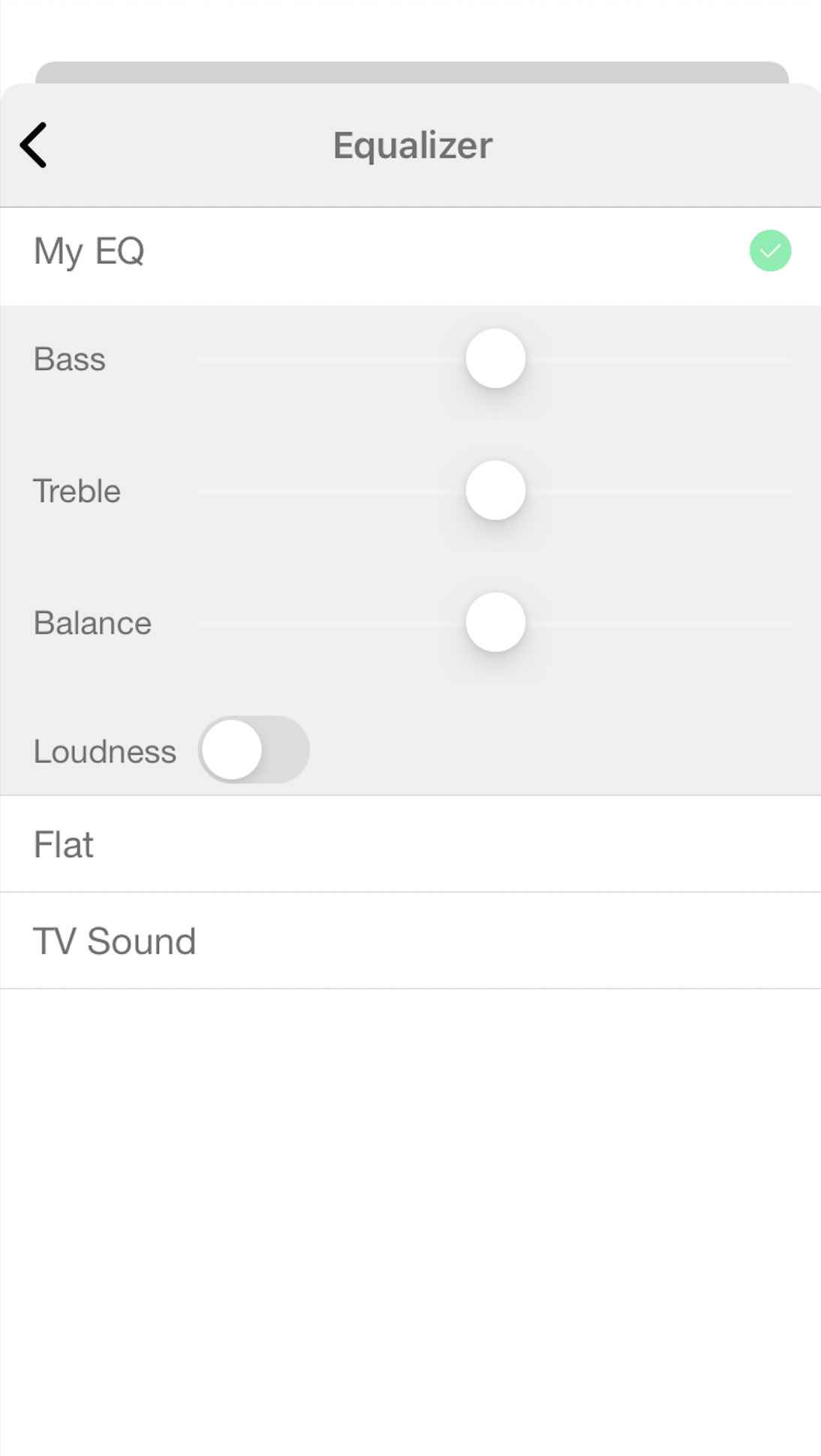
I controlled the EQ options from the app. Listening to the music in ‘flat’ mode, I noted the bass emphasis which was a surprise for such a diminutive product like this. Upper mids and treble were good although dynamic extension wasn’t really present here. If anything treble and upper mids were rolled off but were also a little tense and edgy.
Selecting the TV Sound EQ provided a stretched, more expansive presentation which removed a lot of the upper midrange tension and a broader soundstage.
I tried the tone controls (i.e. bass and treble) but they merely added emphasis instead of remodelling the sound itself which was no help at all. Similarly, the included Loudness option was redundant because the default bass emphasis. Switching on Loudness almost shook the chassis into kindling. So no. I returned to the TV sound option which reigned in the over-eager midrange, balanced the bass a touch and provided more context for the treble output.
I actually thought the TV Sound option was more balanced and neutral than the ‘flat’ default.
The Musica doesn’t have the midrange insight of the Ruark or the lower-frequency weight of the Ottova or the soundstage complexity of both. Nevertheless, within its own restricted sonic boundaries, the Musica offers a perfectly balanced and relatively open sound output. Especially for its size. The TV Sound EQ has a big say in that sonic presentation. It adds a rather cultured, slightly sophisticated presentation that you just don’t hear in the default ‘flat’ mode.
STREAMING
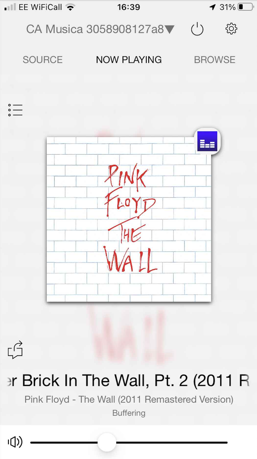
I switched to Amazon Music and Pink Floyd’s Another Brick in the Wall Pt.2 because “we don’t need no education”, apparently. You do if you have ambitions of writing a grammatically correct sentence, I would suggest, Mr Waters.
Sonically, I was impressed with the bass impact from this Internet source. AC/DC’s Shoot to Thrill had real momentum and tickled the ear with a rocking excitement. The Musica’s bass emphasis gave rock a real leg up here.
INTERNET RADIO
Turning to jazz and Al Jarreau’s I’m Beginning to See the Light, the inherent lack of dynamic reach was helped here by the open and spacious soundstage generated by the TV Sound EQ option which positioned the more delicate midrange sounds carefully to give the sound a seemingly delicate and elegant presentation. As long as the gain wasn’t too high, that is. Otherwise, the mids began to tense again.
BLUETOOTH
Pushing Kylie Minogue’s All the Lovers over Bluetooth from my phone, I was happy to hear that this lossy file did not produce a bright, harsh sonic output.
Sure, I could hear sonic restrictions but, as I say, this was a lossy file. There was still air around the mids in the soundstage and detail was easily picked out by the ear so there was still a level of sophistication in the music presentation here.
HEADPHONES
I popped a pair of Sennheiser HD 660S headphones into the rear of the chassis and listed to the Design CD. Sound was generally good. The treble output was slightly clinical during crescendos but, apart from that the mids offered plenty of detail while bass was solid and meaty.
CONCLUSION
The most important conclusion I found during this review was this, the Como Musica is over priced. There is plenty to like here and there are many features on offer but the Musica is not worth the asking price. The price needs to be reduced. Ideally, by hundreds of pounds.
When positioned around my house as a luggable music source, the Como Musica proved to be an efficient and effective sound source. In absolute terms, sound was restricted in terms of just how far it could go and the amount of information it could give to the ear but the fine detail is less important in a product like this.
I wouldn’t expect you to be rooted in front of the Musica, analysing the finer points of the soundstage with critical application. The Musica is for more casual and mobile listening. That is, listening while mooching around the room getting on with chores and tasks. In this way, the Musica offers everything you need: lots of features and a decent if hardly sparkling sound output. In short, the Como Musica remains a good option as a lifestyle sound source.
COMO MUSICA MUSIC SYSTEM
Price: £949
Website: https://www.connecteddistribution.com & comoaudio.com
GOOD: compact size, feature packed, easy to use, EQ options
BAD: price, prosaic design, build quality, on-radio interface, switch labelling, narrow soundstage, midrange and treble roll off
RATING: 6
[Don’t forget to check out my Patreon Page at www.patreon.com/audiophileman, for exclusive postings and more!]
REFERENCE
Blue Horizon Professional Rack System

